Built for the cashier who can’t see the screen.
Most registers treat accessibility as an add-on. This one starts with it. It’s designed for JAWS, NVDA and VoiceOver, for braille displays, for the keyboard, and for low vision, so everyone on your team can run the counter on their own.
Built for blind cashiers from the start
Not a setting, a plugin or a patch. Every screen was designed for someone who can't see it before it was designed for someone who can.
The non-visual path is the main path
It's designed so a blind cashier can ring up a sale, split a payment, give change and close the drawer without asking a sighted colleague for help.
Shaped with the people it's for
Built with American Printing House for the Blind (APH), for a counter where some of the staff are blind or have low vision.
Every step of the sale, spoken plainly.
Scans, cart changes, payments, errors and the drawer are announced as they happen, written to be heard, not just read.
The key fact comes first
"Change due $4.50" before anything else, so it's the first thing heard and the first thing on a braille display.
Said once, clearly
Each event is announced once. Nothing repeats while nothing changes.
Money is spoken as money
Dollars and cents, never "4 point 5".
No symbols read aloud
"Visa •••• 4242" is read as "Visa ending 4242". No bullets, arrows or dots.
Missed it? Hear it again
F4, Alt+A or the Repeat button says the last announcement again.
Hear the register
Real announcements, word for word, from one day at the counter.
An item is scanned
“Added Ceramic Mug, $16.00.”
Name and price, nothing else.
The card is sent
“$52.50 sent to Front counter. Ask the customer to tap, insert or swipe.”
Which reader, and what to tell the customer.
The card is read
“Card read. Waiting for approval.”
Said once, not repeated while nothing changes.
The card is approved
“Card approved. $52.50 paid. Sale complete.”
The money first, then the outcome.
Part of a split payment
“Paid $20.00 by card. $32.50 left to pay.”
Always what's left to pay.
Cash is taken
“Change due $4.50. Paid $50.00 cash. Sale complete.”
The change comes first, so braille shows it first.
A card is declined
“Card declined: insufficient funds. Ask for another card or payment method.”
What happened, then what to do.
A supervisor types a PIN
“4 of 6 digits entered”
The digits themselves are never spoken.
The drawer is counted
“Short by $1.00.”
Over, short or balanced, in words.
Written for braille displays, too.
Many braille displays show only 20 or 40 characters at a time. So the register puts the fact that matters in the first 20, and keeps urgent messages short.
- The key figure leads: “Change due $4.50”, “Card declined: insufficient funds”.
- Urgent messages stay under 140 characters. Anything longer follows as a separate, calmer message.
A full sale without touching the screen.
Everything works from a keyboard, including split payments, exchanges and the supervisor’s PIN pad. A USB or Bluetooth barcode scanner works alongside it.
On a Mac or iPad keyboard, Alt is the Option key. Keyboards without F-keys can use the Alt shortcuts or the Repeat button.
| Keys | What it does |
|---|---|
| F2 | Jump to product search, from anywhere |
| F4orAlt+A | Repeat the last announcement |
| Alt+O | Go to checkout |
| Alt+C | Pay by cash |
| Alt+R | Pay by card |
| ? | List every keyboard shortcut |
| Esc | Close a dialog or panel |
Big, bold and set the way each person needs it.
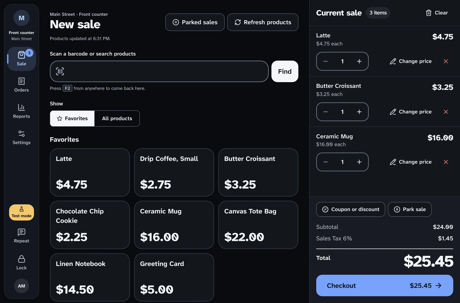
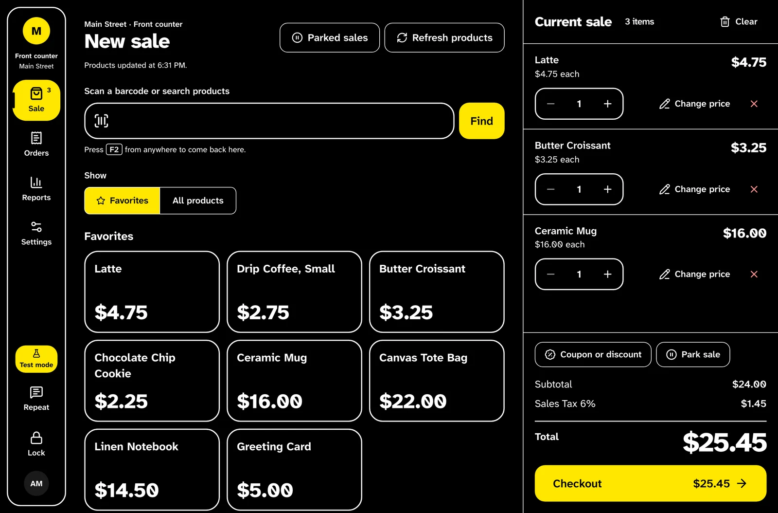
Try it: change the text size and theme, and watch a slice of the Sale screen reflow.
At 200%, rows wrap instead of clipping, and nothing scrolls sideways. Each person’s choice follows them to any register.
Text up to 200%
100, 125, 150 or 200%, chosen per person. The whole register reflows, up to 400% zoom.
Five themes
Light, dark, auto, high contrast in black, white and yellow, and Windows forced colors.
Money you can read across the counter
Totals, amount due and change due are set very large, with figures that line up.
A typeface made for low vision
Atkinson Hyperlegible Next, designed by the Braille Institute so similar letters can't be confused.
Focus you can't miss
One solid 3px focus ring everywhere, and touch targets of 44 to 64 pixels.
Never color alone
Every status has an icon and words. Out-of-stock items keep full-contrast text and get a dashed edge.
Know it worked without looking.
Optional sound cues, each with its own shape so they can’t be confused. Choose the volume, and add vibration on Android. Sound is never the only signal: every cue comes with words on screen and an announcement.
- Item added
- One short, high blip
- Card reader waiting
- Two soft notes, rising
- Approved
- Three notes rising
- Declined
- Two low, buzzy notes falling
- Something to check
- Two level beeps with a gap
- Drawer over
- A rising slide
- Drawer short
- A falling slide
- Drawer balanced
- Two level notes
The details that make it work at a busy counter.
Focus that follows the work
- Focus moves to each screen's heading, and the screen change is announced.
- Choose Cash and focus goes to Amount received. Choose Card and it goes to the card step.
- Dialogs keep focus inside, close with Esc, and return focus to where you were.
- Skip links jump past the navigation, straight to product search or the cart.
Private at the counter
- A supervisor's PIN is never read aloud. Screen readers hear "4 of 6 digits entered".
- Customer search shows only the last four digits of a phone and a masked email.
- Card numbers are read as the brand and last four digits, nothing more.
Settings that follow the person
- Text size, theme, product layout, motion, sounds, volume and vibration are saved for each person.
- Sign in at any register and it looks and sounds the way you set it.
- A short guided setup on first use, with a live preview, announces each step.
Calm by design
- Reduce motion turns off movement, per person or from the device setting.
- Frosted-glass panels become solid when the device asks for less transparency.
- Quick confirmations never move anything on screen.
Held to a standard, checked every time.
The register targets WCAG 2.2 AA, with AAA contrast wherever it’s practical.
Automated accessibility checks run against every screen and dialog, including in high contrast at 200% text, so an update can’t quietly break what works today.
And it was shaped with American Printing House for the Blind, for a counter where some of the staff are blind or have low vision.
Ring up a sale yourself.
The live demo is the real register, running in your browser with nothing to install. Turn on your screen reader and try a full sale.